In this article I show you how to create and design a landing page that generates high conversion rates. The formula outlined below is a “best fit” solution for most cases, but depending on your product, service, or offer you may want to add or take away sections.
Before we get started, this formula will not guarantee an increase in conversions but it is a solid starting point which should help guide you on the right path. Where the real conversions come from is using the formula outlined below paired with strong messaging, call-to-actions, supporting images and most importantly your offer or product itself. But enough talking and let's get into it.
9 Components to a High Converting Landing Page
A strong landing page can be broken down into 9 main components and each one has a specific job in convincing a visitor to purchase your product or service.
- Simple & Sticky Header
- Main Offer (Above the Fold)
- Mini Social Proof
- Benefits & Advantages
- Showcase Your Product, Services, or Features
- Testimonials
- Objection Handling - FAQs
- Call-to-action
- Useless Footer
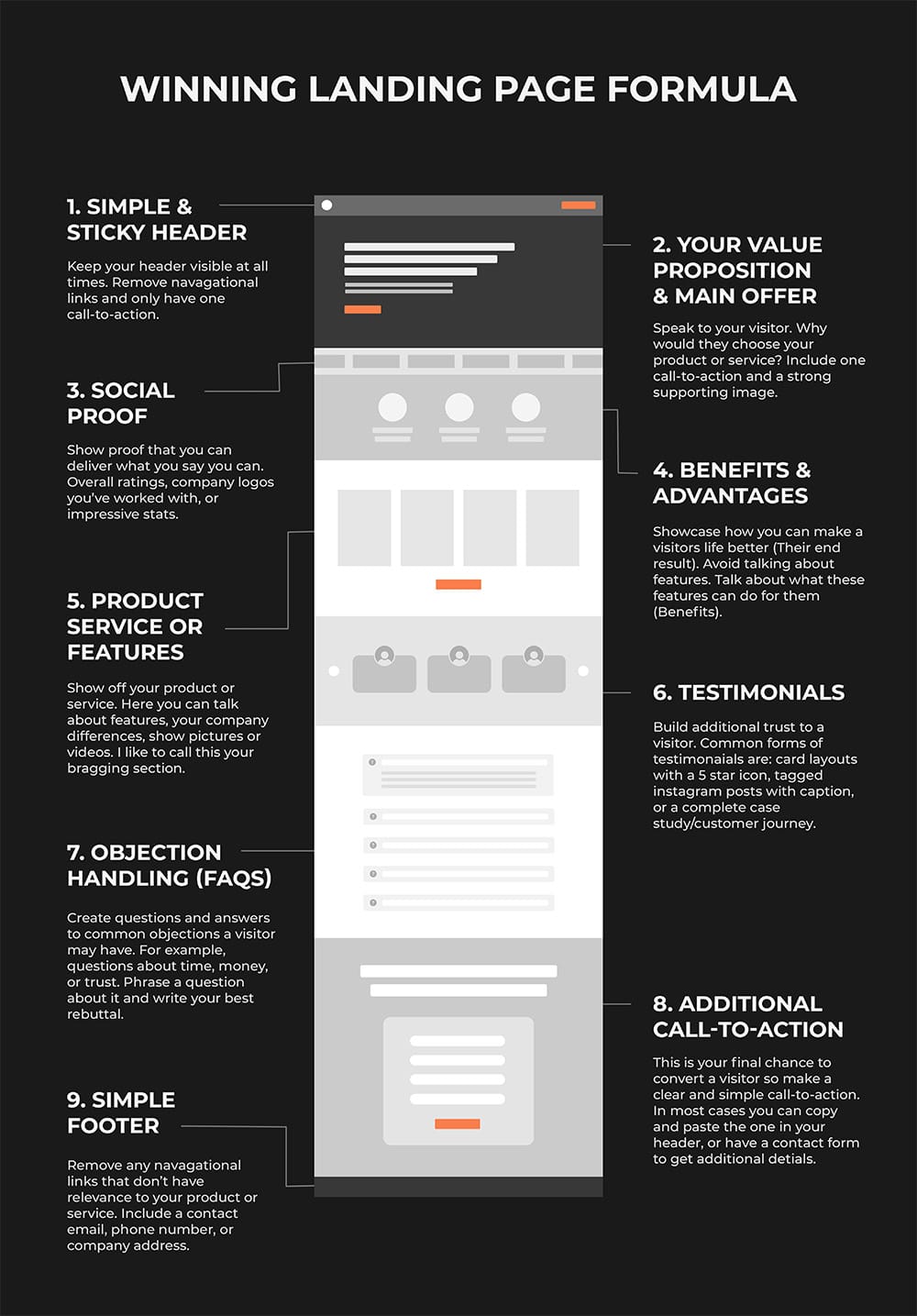
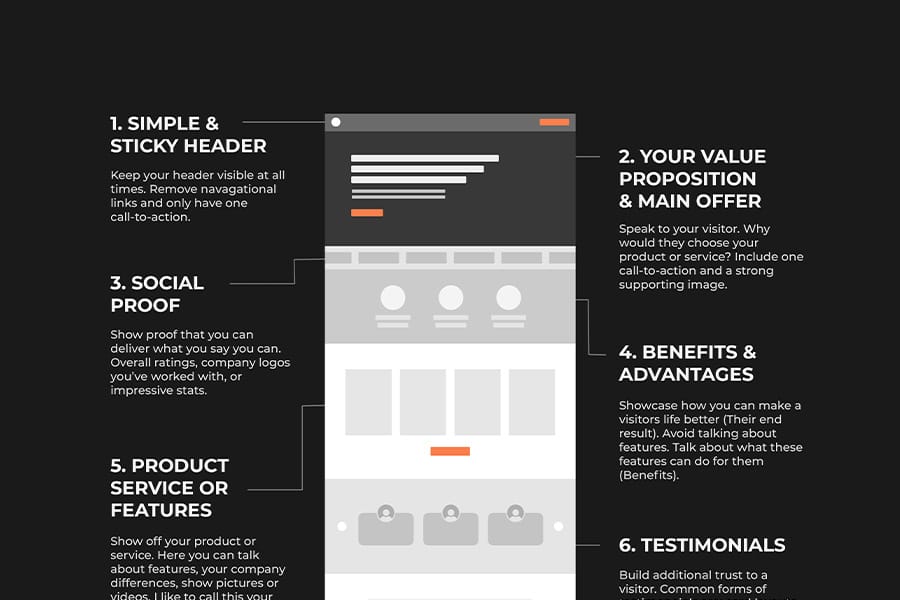
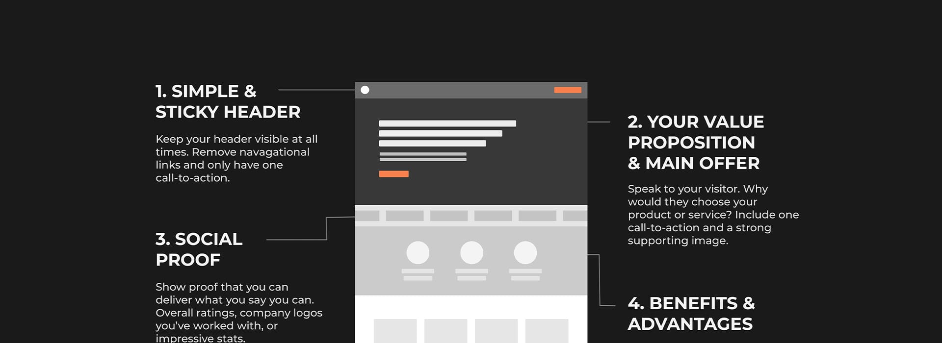
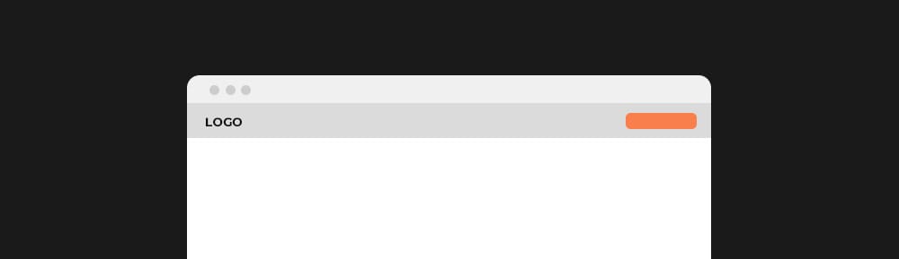
1. Simple & Sticky Header
The first thing we need to handle before creating any content on your landing page is cleaning up your header and its behavior. Your header only needs two components:
- Logo
- One call-to-action
You may be wondering about your navigational links you commonly find in a header, and the answer is yup remove them. This isn’t necessarily a deal breaker to still have them in your header but if you’re really trying to optimize your landing pages for sales and conversions additional links could cause distractions. Just think about it, if your ad keywords or targeting is bang on you know the people clicking on your ad want what you have to offer, so why provide any additional options? The goal is to get the person clicking your ad to buy your product or service not browse around.
The next thing is setting your header to behave what is known as “sticky”. This means your header is always pinned to the top of your viewport and visible no matter how far down you scroll. I won’t go into great detail in this article but to keep things quick and simple, reports show sticky headers increase conversions from roughly 5-10%.
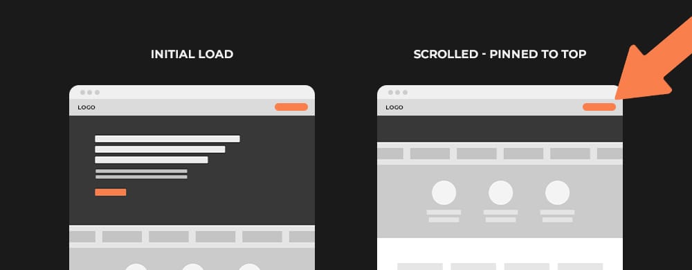
If you’d like to know more about sticky headers and their increases in conversions, you can get the full breakdown here: Should You Use a Sticky Call to Action & Header to Get More Conversions?
2. Above the Fold
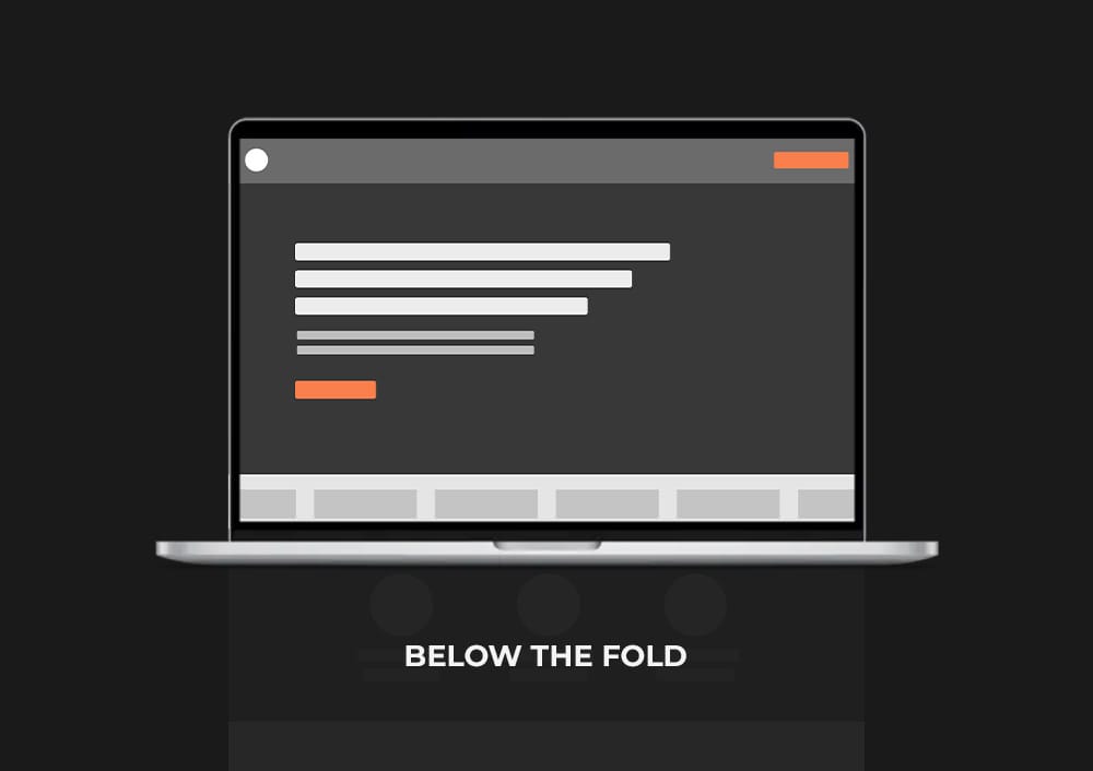
Next up is the most important section of any landing page and it is known as “Above the Fold” or the “Hero Section”. Above the fold means everything that is visible at the initial load without scrolling.
There are 3 sub components to this section and each plays an extremely important role. The reason they are so important is because if you don’t get this section right your visitor is going to leave without even giving your product or service a chance. Think about this section as your first impression, and your job here is to interest them enough to continue scrolling.
- Value Proposition & Main Offer (Headline)
- Strong Supporting Image
- One Call-to-action
Value Proposition & Main Offer (Headline)
Also known as the heading (H1), this is the big large text that your visitor reads first.
This is where you outline your main offer or value proposition, and is arguably the most important component to your entire page. A value proposition is a simple statement that summarizes why a customer would choose your product or service. When you go to write your headline try to focus on:
- - The big idea
- - The end result
- - The transformation that your product or offer promises
Creating a strong headline is extremely complex and could be an entire article on its own. But to keep things short and sweet a common formula marketers and copy writers use to create a captivating headline is:
[Your Product, Service, Offer] + [Big Promise] + [Hook]
Write down these three questions, answer them, and find a clever way to string it all together and you’ve got yourself a solid headline.
- What’s the product, service, or offer?
- What’s your promise?
- What makes question 1 so special?
Things to avoid in headlines!
- A description about your product or service
- A list of features
- A slogan or tagline
- Talking about your business like an about us section
These will all be included later, but the sole purpose of your above the fold section is to generate interest and speak to your visitor and their end result, not speaking about your product or service itself.
Also make sure to include a subheadline directly below your main offer, explaining how you’re going to get them at that result. You basically call out the thing you offer here. For example:
“With our customized skincare for any age”
“With our 5 step checklist for …”
Everything I just outlined above can be intimidating if this is your first time writing a headline. So if you can’t come up with anything or would like to use tools to give yourself some inspiration, here are a few websites I personally like to use when my creative juices dry up:
Strong Supporting Image
Now there are many ways you can go about displaying an image in your hero section
- Full Background Image
- Beside Your Heading
- A “Teaser”
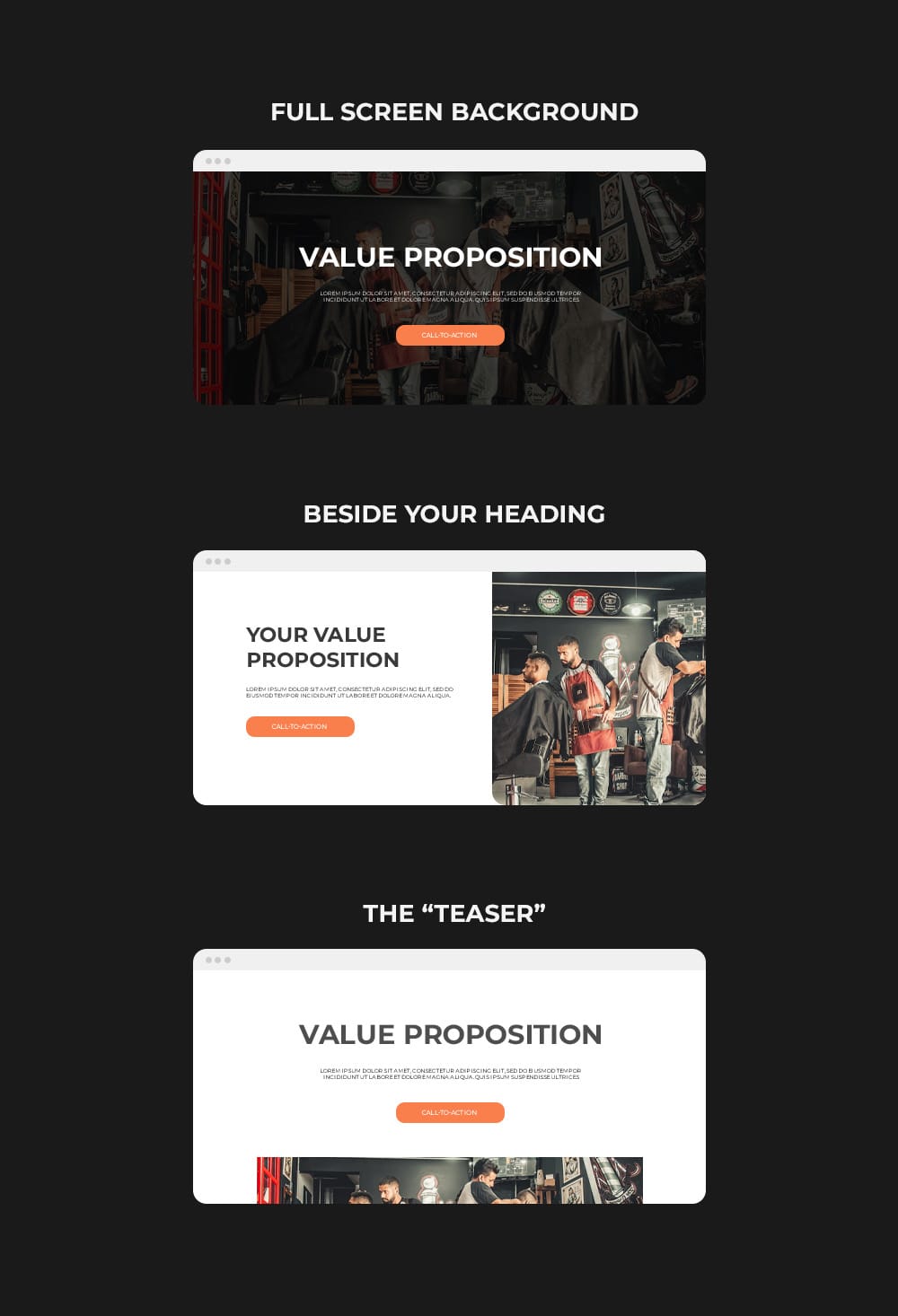
The reason why a strong supporting image is important is because it reassures the visitor they are in the right spot without having to think or read anything. It also starts to generate interest and shows the quality of your product or service.
One Call-to-action
This goes without saying but whatever you want the end goal of your visitor to be should be immediately accessible above the fold. Remember that you only want one call-to-action, and keep it consistent throughout the remainder of your page. If you choose to use “Add to cart” there should only be buttons with “Add to cart” on your page. This will dramatically increase your conversion rate as your visitor only has two options, to buy your product/service or leave.
3. Social Proof
Next up is adding some mini social proof. The whole idea here is to quickly show proof that you can deliver what you say you can. Some common examples would be:
- Overall ratings review (Trustpilot, Google, Facebook, Yelp)
- Logos with other well-known businesses you’ve worked with
- Quick stats relevant to your offer (How many people you’ve help, how much money you’ve made people, etc)
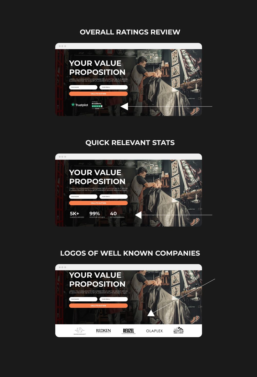
This could have been included in the “Above the fold” section but I decided to isolate it because you commonly see it right below the first call-to-action or a stand alone section immediately after. This section is pretty flexible with how you display it, and there is no right or wrong answer, just what fits your overall design and flow the best.
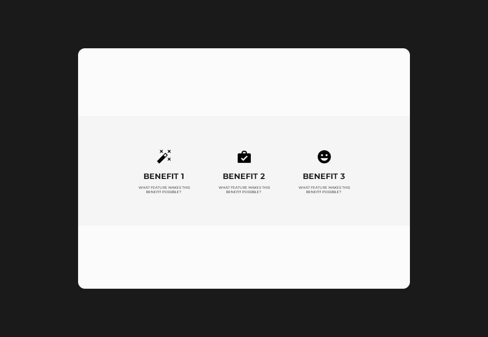
4. Benefits & Advantages
Now if you’ve created a stellar above the fold section a majority of your visitors will convert in that first section alone, but for those who need an extra push this is where the following sections come in.
The next section is showcasing your benefits and advantages where you explain how your product or service makes their life better. A common mistake people make here are showcasing features. Features are just things, while the benefits are what those things can do for your visitor.
A good formula to follow when trying to come up with benefits and advantages is listing out your features and asking yourself “Why should I care about this?”
Feature: Coffee cup - High quality insulation
Benefit: Keeps your drinks hot or cold for hours
Feature: Locker room with complimentary towels
Benefit: Keep your belongings safe while you clean off
Feature: Dog collar - GPS tracking + bluetooth mobile app
Benefit: Know your dogs every step in the palm of your hand
When designing this section it is a good rule of thumb to use 3 benefits, and always pair the text with an icon or supporting image. Research claims text paired with image icons increase the read rate by roughly 80%.
5. Product, Service, or Features
Now this section should be your favorite. It's hard for me to guide you how to create this section as everyone's products, services, and features are different but this is the section where you can finally talk about what you have to offer. Show off product pictures, services, features, videos, and your differences.
Make sure you have a call to action in this section as it will be very likely the turning point in their customer journey to sign up or buy what you have to offer.
Basically, use this section as your time to show off and design it however you’d like.
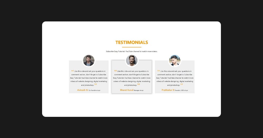
6. Testimonial or Case Study
This section needs no explanation as we’ve all seen testimonials, but I will outline a few different examples you can use to stand out from the crowd that do a fantastic job in building a visitor's trust with your product or service.
Classic Testimonials
Probably the most common testimonials you’ll see are the card layouts that include a picture, review, and 5 star icon. Keep in mind for this type of testimonial you only want to showcase a small snippet of the entire review. Keep it short and sweet to what's relevant to the page. (Image Source)
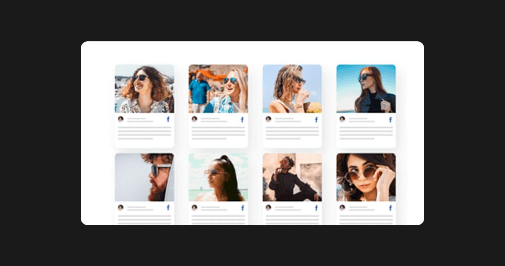
Social Media Tagged Posts
An excellent way to stand out is to showcase your tagged posts and include the review alongside the picture/video. These build high levels of trust as customers can see someone was willing to post your product or service to their person page recommending you. (Image Source)
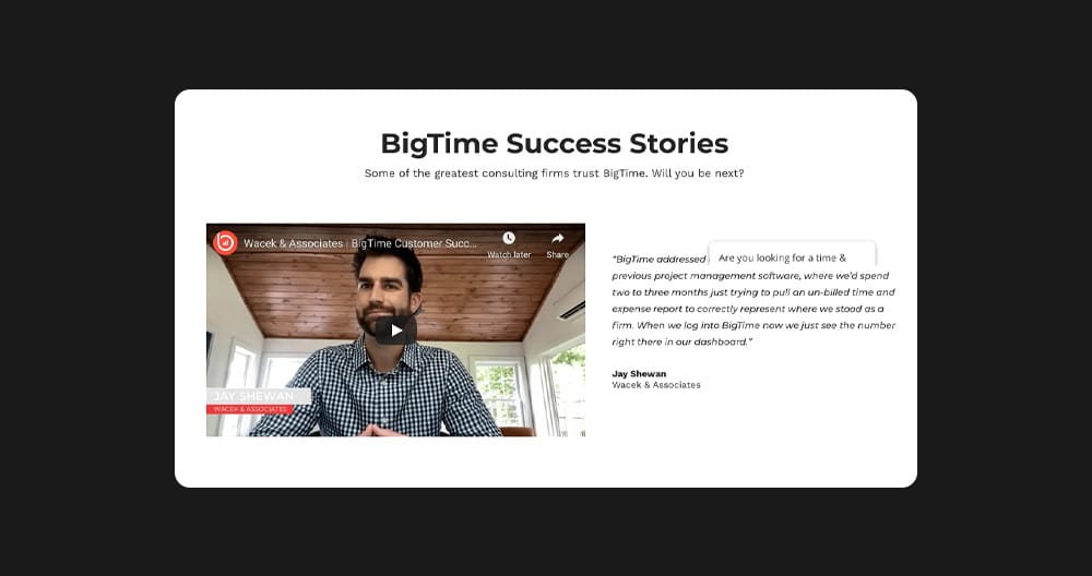
Case Study
This one is not as common as the two above, but try tying a testimonial to a customer's unique story. Outline the challenge you solved through a story and include the customer's kind words to connect on a deeper level with your visitor. I personally believe this is the strongest form of displaying a testimonial, and will increase your conversions significantly. (Image Source)
7. Objection Handling - FAQs
This section is more than answering common questions, but handling objectives a customer may have with your product or offer. Some common objectives are:
- Money
- Time
- Trust
Whatever your objections may be, you want to phrase a question about it and write your best rebuttal as the answer. Feel free to include some extremely common questions too, just to save yourself a headache of repeatedly answering down the road. It is also good to mix these in so it's not so obvious how you structured these questions to encourage a sale, some visitors can see through this tactic.
8. Additional Call-to-action
And last but not least, a follow up call-to-action. If a user made it this far down the page they gave your product or service heavy consideration, so this is your final chance to drive the conversion.
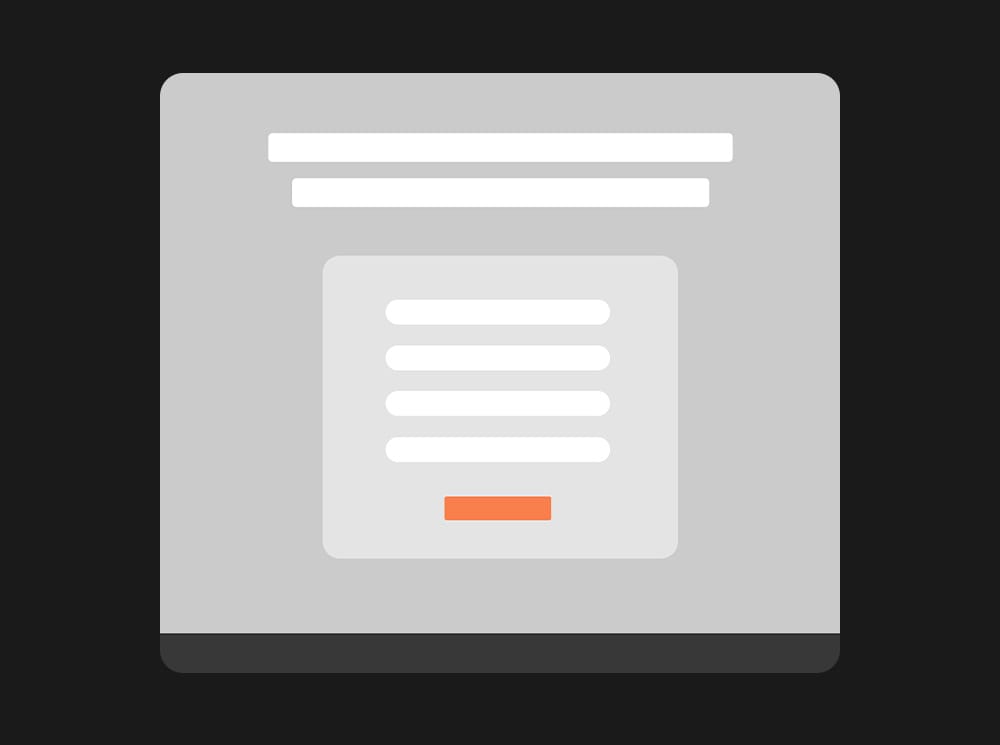
Make sure to keep this call-to-action section super simple and direct. In most cases you can copy and paste the call-to-action and value proposition in your header or have a simple contact form.
9. Useless Footer
Now this section doesn’t really relate to a landing page design but should be noted. A majority of business owners have a templated footer across their entire site which is smart and pretty common when it comes to updates. When it comes to landing page conversions, having a footer with the bare minimum is only going to help, very similar to the sticky header section.
I personally only like to include a logo, company address, and contact email just in case someone would really like to reach out. Again, footers are great navigation resources for your core main website pages, but not for pages you are driving traffic to through ads or organic platforms.
Conclusion
Now this is just the formula to create a high converting landing page, the tricky part is making it look pretty and populating the content. I highly recommend sketching out a rough idea before designing or creating anything - this is coming from a web developer who has wasted hours changing designs because I immediately jumped into the design phase without planning (I learnt the hard way). Anyways, I hope you enjoyed my landing page formula, and I wish you the best in getting more sales and conversions!
Ready to Grow Your Social Media & Ads Sales?