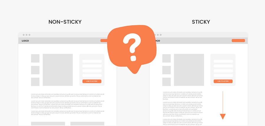
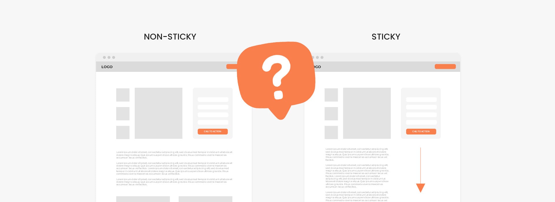
If you’ve stumbled across this article you’re probably wondering if changing your website's landing pages to include sticky call-to-actions will increase sales and conversions.
The short answer is yes, sticky call-to-actions increase website conversion rates and sales! If you continue reading I explain why, show some results, and give tips to help you implement them correctly onto your website.
Before we start, we have to establish that sticky call-to-actions look and behave differently depending on the user's device. In this article I will cover:
- Desktop - Sticky CTA Headers
- Desktop - Sticky CTA Sections
- Mobile - Sticky CTA Placement
- Mobile - Sticky CTA Behaviour
Disclaimer: All results provided were done by other companies and agencies, no tests were done by me. Results also vary from business to business so take the information below with caution as this may not be true for your unique business.
Desktop - Sticky Header Call to Actions
The first sticky call-to-action we are going to explore is located in one of the most common places a user looks on your website when they are ready to take action, your header. In 2023, it is becoming increasingly common to have sticky headers that are pinned to the top of your site as a user scrolls down your page.
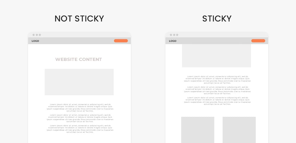
So do sticky headers increase results?
Convert.com & Milosz Krasinski reported sticky menus are 22% quicker to navigate and improved conversions (View source)
Thegood.com saw a 4% increase in conversions (View source)
Guidance.com saw a 6.2% increase in conversions value (View source)
WolfGangDigital saw a 13% conversion increase for their client after applying a sticky header (View source)
Contentsquare.com saw a 10% conversion increase (View source)
It seems that every test and article I came across reported a small increase, but why? As I mentioned above it is the first place a user looks to take action. Now that your header is always on the screen your visitor doesn’t have to scroll all the way back to the top to take any sort of action. Sandra Hurley, Operations Manager of Hayden Girls reported that 85% of users agreed having to scroll back to the top in order to access a call to action or menu was a big hassle and turned them off to continue their shopping experience.
A common theme you will see throughout this article is the easier it is to find your call-to-action the better your results will be.
Desktop - Sticky Call to Action Sections
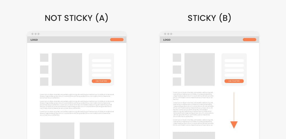
Now what you’re probably looking for are the results for sticky contact forms or sections which include your call-to-action. These are becoming extremely common in the eCommerce space, and slowly making an appearance in service based businesses. So what works better, the normal static contact form (Variation A) or the sticky contact form that follows you as you scroll (Variation B)?
There are two theoretical arguments for both variations:
- Argument for Variation A (Not sticky): You don’t want to forfeit 30-50% of your horizontal screen space because it becomes difficult to design something appealing. You also want to avoid coming off as salesy or pushy by hovering over a visitor's shoulder at all times. You feel like if they want to purchase your product or service they will scroll back to the call-to-action.
- Argument for Variation B (Sticky): People can still read about your product and service easily without being annoyed or distracted. You also believe that adding a sticky call-to-action is providing them with an easy ability to purchase your product or service, and in doing so shows you care about their experience - not being salesly or pushy.
Well what are the results?
GrowthRock.co saw a 8% increase in conversions over the course of 14 days based on hundreds of thousands of visitors (View source)
Prismfly.com reported a 15% increase in conversions for their eCommerce client Cobra (View source)
Initially seeing these results was pretty shocking. The reason why I am sharing this article is because I was on the side of Variation A. I was worried that being constantly over my visitors shoulders would turn them away from purchasing any products or services. But after seeing the numbers and giving it some more thought, it makes sense that the more accessible a call-to-action is the more conversions you will get as long as you’re not being to pushy
Please keep in mind that each business and customers are unique, so if you have the resources to personally A/B test the two variations I would do so. If you don’t have the resources to test two landing pages, it is safe to say using a sticky call-to-action section is the better choice if you’re looking to increase your sales and conversions.
Additional side notes:
- When using a sticky contact form or product ordering section, keep it as minimal and simple as possible. The more inputs and selections you have will result in lower conversions. If having a phone number would be nice, but you don’t necessarily need it, don't ask for it.
- Unlike the sticky header which can be applied to all pages of your site and will increase conversions, having a sticky call-to-action section on your core pages (home page, about page, etc) is a big no no. Only consider doing so on your smaller internal service and product pages. Let your main pages focus on informing a visitor about who you are and what your offer, but your “selling pages” should be geared to driving sales and conversions (having a sticky call-to-action).
Mobile - Sticky Call to Action
Now arguably the most important sticky call-to-actions is on mobile devices. As of 2023 nearly 60% of all ad and web traffic is coming from mobile devices so it's very important to get this right. Should you have normal buttons and contact forms static on your page (Variation A) or sacrifice 10-15% of vertical screen space for a sticky button (Variation B)?
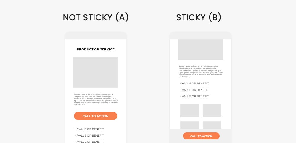
What are the results?
GrowthRock.co saw a 6% increase in conversions (View source)
French fashion retailer Ünkut saw a 13% conversion increase for their client after applying a sticky call-to-action (View source)
EcommerceChecklist saw a 18% increase add to carts and 5% increase in conversions for their client (View source)
So again, the sticky call-to-action wins versus normal on page buttons and forms. But you may be wondering “Where do I put it?”, “What should happen when I click the call to action?”, “Does it scroll to the contact form/purchase section?”. Continue reading and I will breakdown and cover all of these questions.
Where should the mobile sticky call-to-action be placed - Top or bottom?
You really only have two options for a sticky call to action on mobile devices due to limited screen space, the top or bottom. To keep it short and simple you want to keep it at the bottom of your page.
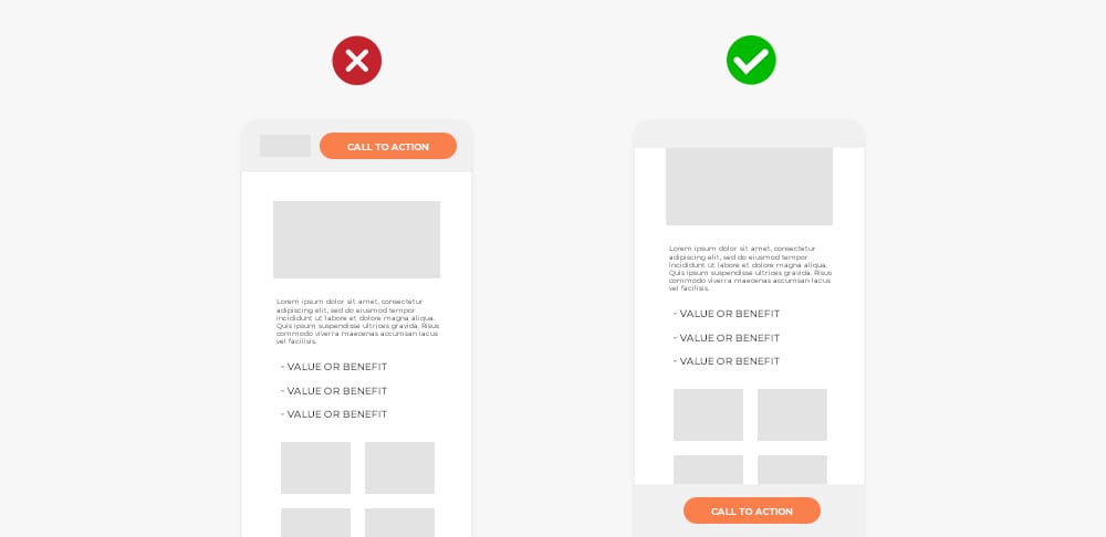
Why place it at the bottom?
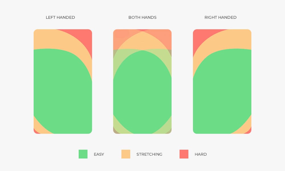
Well personally let's think about it. It is not the most comfortable action to stretch your fingers or readjust your grip to click a button at the top of your phone. No matter how you are holding your phone, clicking the bottom area is easy, where reaching to the top can be difficult for some visitors. As I mentioned before, if it's easier for a visitor to click your call-to-action, the higher conversions you will get. This graphic below shows the area on your phone where users find it most comfortable and natural to click.
But if you’re looking for some extra validation, let's also look at the biggest companies in the world who spend millions of dollars on user experience testing:
Amazon: on the mobile app as you scroll down the “add to cart” button sticks to the bottom
Nike: as you scroll down on a product page the “Add to bag” button sticks to the bottom
Apple: This isn’t directly website related, but the same logic applies. Apple replaced its home button with an on screen sticky action button (Extremely similar to a stick call-to-action) to navigate the entire device.
I highly encourage you to go visit one of your favourite companies and see where they have their call to actions placed, good chance you find it sticky at the bottom. But now that you know to place your sticky call-to-action at the bottom, what should happen once a user clicks the button?
Mobile - Sticky Call to Action Behaviour
There are two common behaviors:
1. When you click you are scrolled the position on screen where you can fill out information or place an order (Variation A)
2. You have a complex “drawer” function where the call to action slides up and now takes up the entire screen (Variation B)
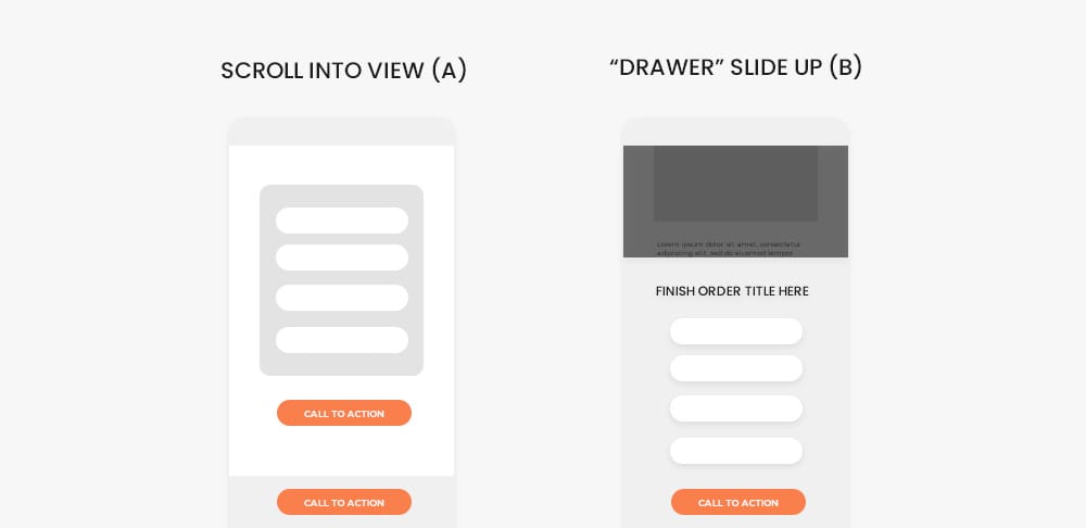
Which one performs better?
According to GrowthRock.co when adding a “drawer” slide up feature (Variation B) they saw a 12% increase in conversions (View source)
But why the increase in conversions? GrowthRock said the slide up drawer may be keeping visitors focused on the contact/checking out process because it feels like you’re in a new “subpage” of sorts instead of just scrolling to another part of the website.
Now adding this to your website may be tricky if you are building it yourself, but it is definitely worth researching after seeing such a big increase in conversions. Some common phrases to search for would be:
“(Your Website Builder or Theme Name) mobile sticky call to action slide up”
“(Your Website Builder or Theme Name) mobile drawer slide up function”
“(Your Website Builder or Theme Name) mobile sticky call to action order process”
“(Your Website Builder or Theme Name) mobile sticky call to action lightbox”
If you have a digital marketing team or web developer they should have no problem implementing this for you. Just reference this article and explain to them the statistics when it comes to conversions and they should be more than happy to add this!
Conclusion
I am glad you stuck around (I couldn’t help myself) and hope you found this article helpful. Interesting to think about how a few little changes can make such a huge impact on your profits. Yes, 5-10% differences doesn't seem like much but when you’re doing $200,000 in yearly sales that's an extra $20,000 for a few minor website edits.
One curveball I do want to throw at you is; was I only able to find positive results online because no one likes to share their losses? I personally think not because there are alot of honest marketers who would try to warn other business owners of making the same mistake and losing money. I also strongly believe sticky call-to-actions is the best way in maximizing landing page conversions, and I include them on all of my clients websites. I don't want to scare you off after reading this entire article but it is something to consider.
Anyways, I hope this article inspired you to implement some sticky call-to-actions on your website. If you find success (which you should) please remember to come back to this article and let me know, I’d love to hear some success stories.
Ready to Grow Your Social Media & Ads Sales?

